Readability
How to Make Thumbnail Text Readable on Every Screen
Why thumbnail text fails at small sizes and eight practical rules to fix it: word count, letter size, typeface, outlines, background control, highlights, safe zones and testing.
By the Thumio.app editorial teamUpdated 6 min read
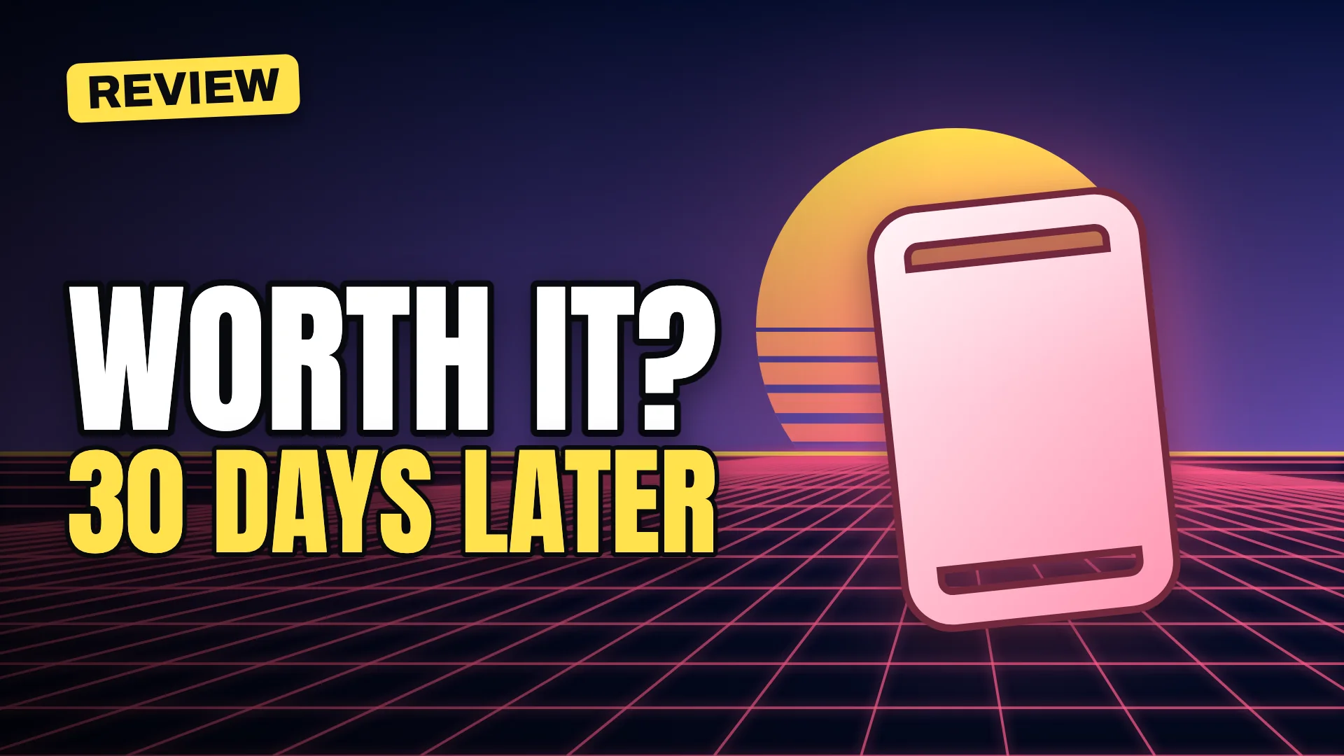
Most unreadable thumbnails were designed at full size on a large monitor and never checked at the size viewers actually see. This guide explains why text fails when it shrinks and gives you eight rules that keep it readable on every screen.
Why thumbnail text fails
A thumbnail can be shown at roughly 168 × 94 pixels in a desktop sidebar. At that size, a headline that looked bold in your editor may be only a few pixels tall. Thin strokes disappear, similar colours merge and long lines turn into texture. Readability is not a property of the file; it is a property of the file at its smallest common size.

Eight rules for readable thumbnail text
1. Use three to five words
Every extra word makes the others smaller. Move explanation to the title and keep only the hook in the image.
2. Make letters big relative to the frame
A practical rule of thumb we use in Thumio templates: the main line of text should have a capital-letter height of at least about 12 to 15 percent of the thumbnail’s height. At sidebar size, that keeps capitals around a dozen pixels tall, enough to read at a glance.
3. Choose heavy, condensed type
Condensed display faces fit more letters into the same width while keeping strokes thick. Avoid light weights, scripts and decorative fonts for the headline. Use them, if at all, only for small secondary details.
4. Add an outline or a shadow
An outline around the letters guarantees contrast against any background. In Thumio templates the outline is about 8 to 9 percent of the font size, thick enough to survive scaling down without looking heavy at full size. A soft drop shadow adds depth and separation.
5. Control the background behind the text
Darken or simplify the part of the image the text sits on. A gradient from dark to transparent across the text side of the frame is the most reliable technique, and it keeps the rest of the image vivid.
6. Highlight one word
Colour the word that carries the hook, such as the number, the twist or the emotion, in a bright accent. One highlight guides the eye; three highlights cancel each other out.
7. Stay out of covered areas
The bottom-right corner shows the video length, and a progress bar can appear along the bottom edge for partly watched videos. Keep text clear of both.
8. Test before you publish
Three quick tests catch most problems:
- Small size: view the thumbnail at about 168 pixels wide.
- Grayscale: check that text still separates from the background without colour.
- Squint: blur it slightly; the headline should remain a clear shape.
The free thumbnail preview tool runs all three, plus desktop and mobile feed simulations.
Need better words?
Readable text starts with short text. Our thumbnail text formulas help you turn a long title into a three-word hook, and the free maker applies outlines, shadows and auto-fit sizing for you.