YouTube Thumbnail Ideas for Every Niche
Forty thumbnail ideas across ten creator niches, eight text formulas you can reuse, and example designs you can open and edit in the free maker.
Last reviewed
Thumbnail text formulas that work across niches
Fill in the brackets with your own video. Each formula fits in three to five words.
[Result] in [time]
“I beat it in 7 minutes”
[Price] + [thing]
“$500 gaming PC”
[A] vs [B]
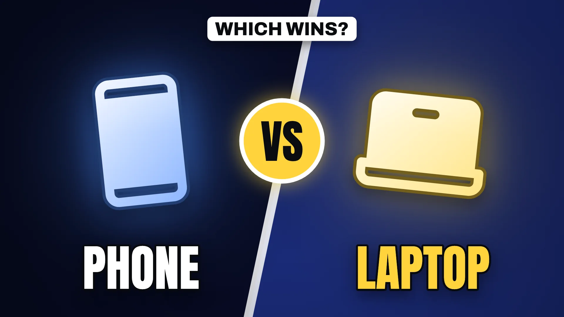
“Phone vs laptop”
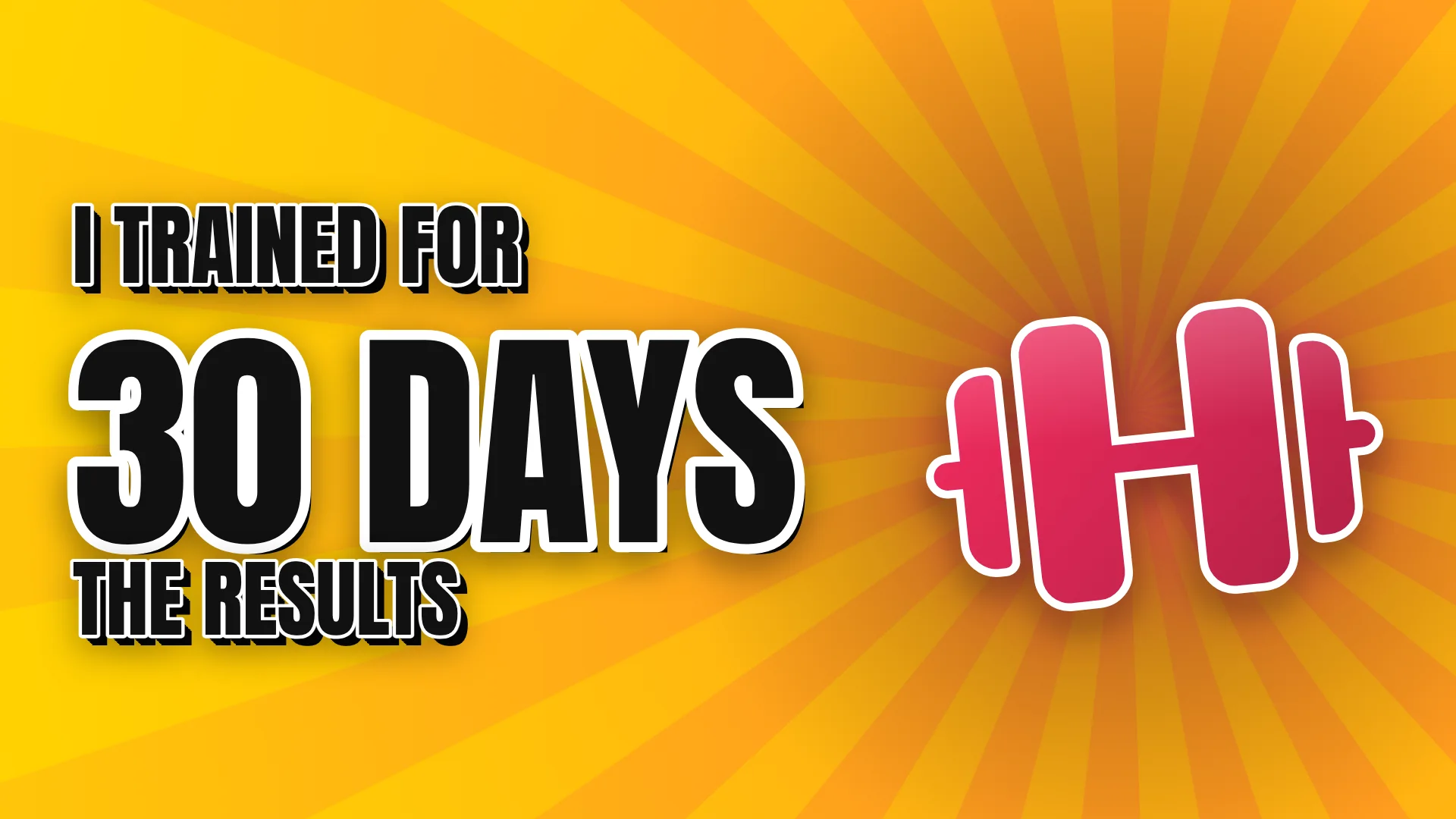
I tried [thing] for [time]
“I trained for 30 days”
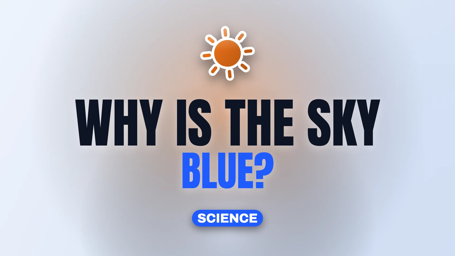
Why [surprising question]?
“Why is the sky blue?”
Stop [common habit]
“Stop doing this”
The real [thing]
“The real ending”
[Place] under [budget]
“Tokyo under $100”
Gaming thumbnail ideas
Gaming thumbnails win on energy and a clear outcome. Show the result, the stakes or the transformation, not the menu screen.

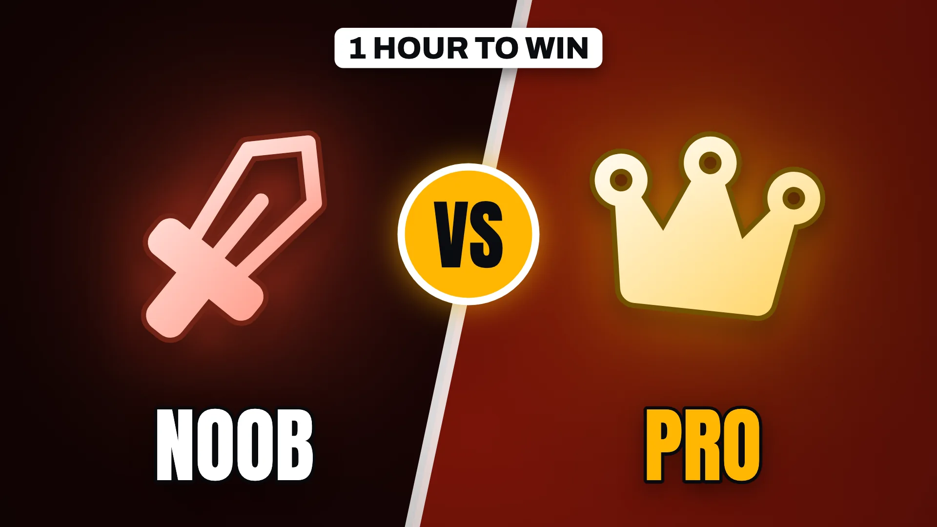
Reveal the result
"I beat it in 7 minutes" is more specific, and more clickable, than "speedrun attempt".
Noob vs pro
Two skill levels side by side create instant tension and a reason to watch the comparison.
Hardest mode with a timer
A countdown badge turns a normal playthrough into a challenge with stakes.
Update explainer
Put the changed item or character front and centre with a short question. Use captures you own rather than official key art.
Technology thumbnail ideas
Tech viewers click on value and verdicts. Prices, comparisons and long-term reviews give them a fast reason to care.

Lead with the price
"$500 PC" frames the whole video as a value story in two words.
Head-to-head
Two devices facing off with a VS badge make the comparison obvious before the title is read.
The long-term verdict
"Worth it? 30 days later" promises an answer that a launch-day review cannot.
The hidden setting
A ring around one setting and "Turn this off" is a classic curiosity hook for tutorials.
Finance thumbnail ideas
Finance thumbnails need credibility first. Let a single number or a clear warning carry the frame, and skip the piles of cash.


Milestone number
"$10K month" with a rising chart supports the claim without extra words.
Mistake warning
"Stop doing this" plus one familiar object creates curiosity about the mistake.
Simple comparison
"Rent vs buy" on a split background promises a clear answer to a common decision.
The breakdown
"Where my money goes" works with a single wallet or chart subject and a calm palette.
Travel thumbnail ideas
In travel, the place is the hook. Give the scenery the frame and add a constraint that makes the trip a story.


Destination plus constraint
"24 hours in Tokyo under $100" turns a city guide into a challenge.
Hidden places
"Hidden Iceland" promises something most viewers have not seen yet.
Expectation vs reality
A split frame comparing the postcard view with the real one invites a story.
The route
"7-day road trip" with a location badge sets scope and helps planners find you.
Vlogs thumbnail ideas
Vlog thumbnails sell a person and a moment. Specific times, roles and life updates beat generic "my day" framing.
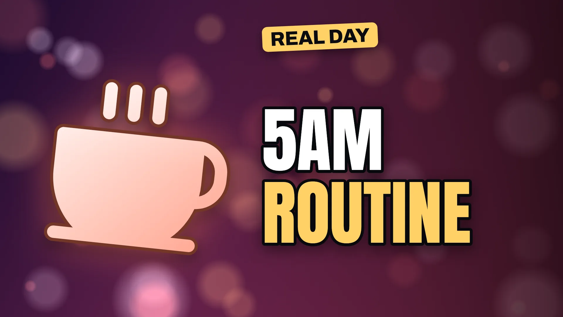
A specific time
"5am routine" is more intriguing than "morning routine".
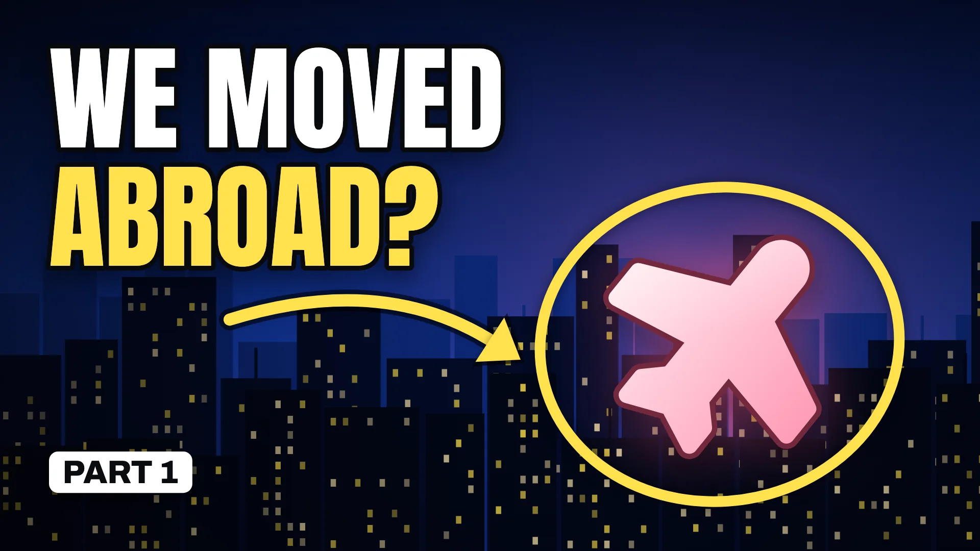
The life update as a question
"We moved abroad?" turns news into curiosity.
A day in a role
"A day as a night-shift nurse" tells viewers exactly whose life they will see.
A personal experiment
"I said yes to everything" sets up a story with a built-in arc.
Podcasts thumbnail ideas
Podcast clips and episodes compete with videos that have motion. A bold quote-style hook and clear audio cues make them feel watchable.
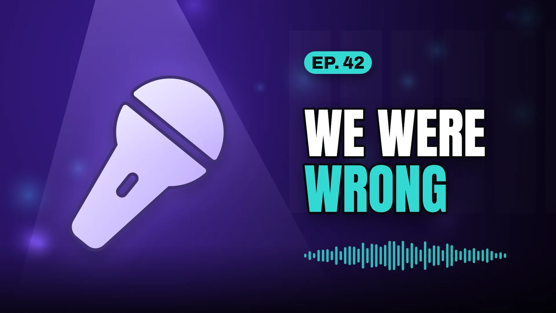

The confession
"We were wrong" promises a moment of honesty.
The guest's hardest story
"My hardest year" frames a long conversation as a personal story.
The hot take
"Unpopular opinion" invites viewers who want to agree or disagree.
Episode number plus one word
"Ep. 42: Burnout" helps regular listeners and states the topic plainly.
Reactions thumbnail ideas
Reaction thumbnails sell an emotion. Keep the words to two and point at the moment that caused it.
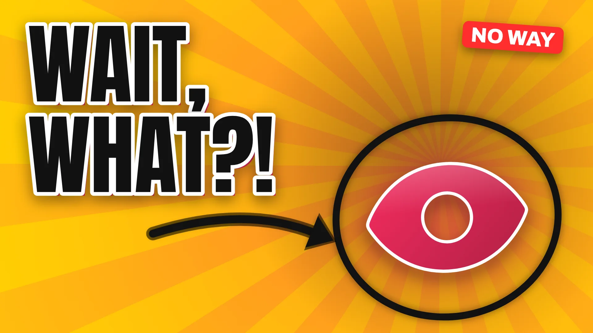
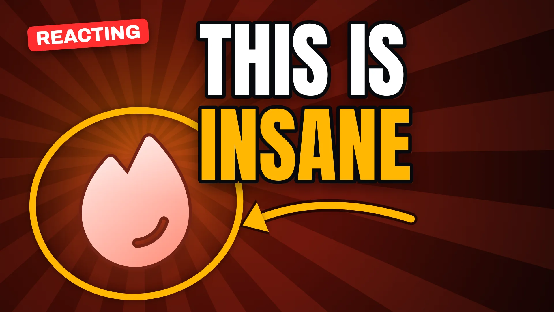
Two-word emotion
"Wait, what?!" carries the feeling at any size.
Point at the moment
An arrow and a ring around the key detail tell viewers where to look.
The rating reveal
"Rating every ..." with a big score badge promises a verdict.
First time watching
A first-reaction label sets expectations for authentic surprise.
Education thumbnail ideas
Education thumbnails should lower the effort to click. Promise one clear outcome and show one visual that names the topic.
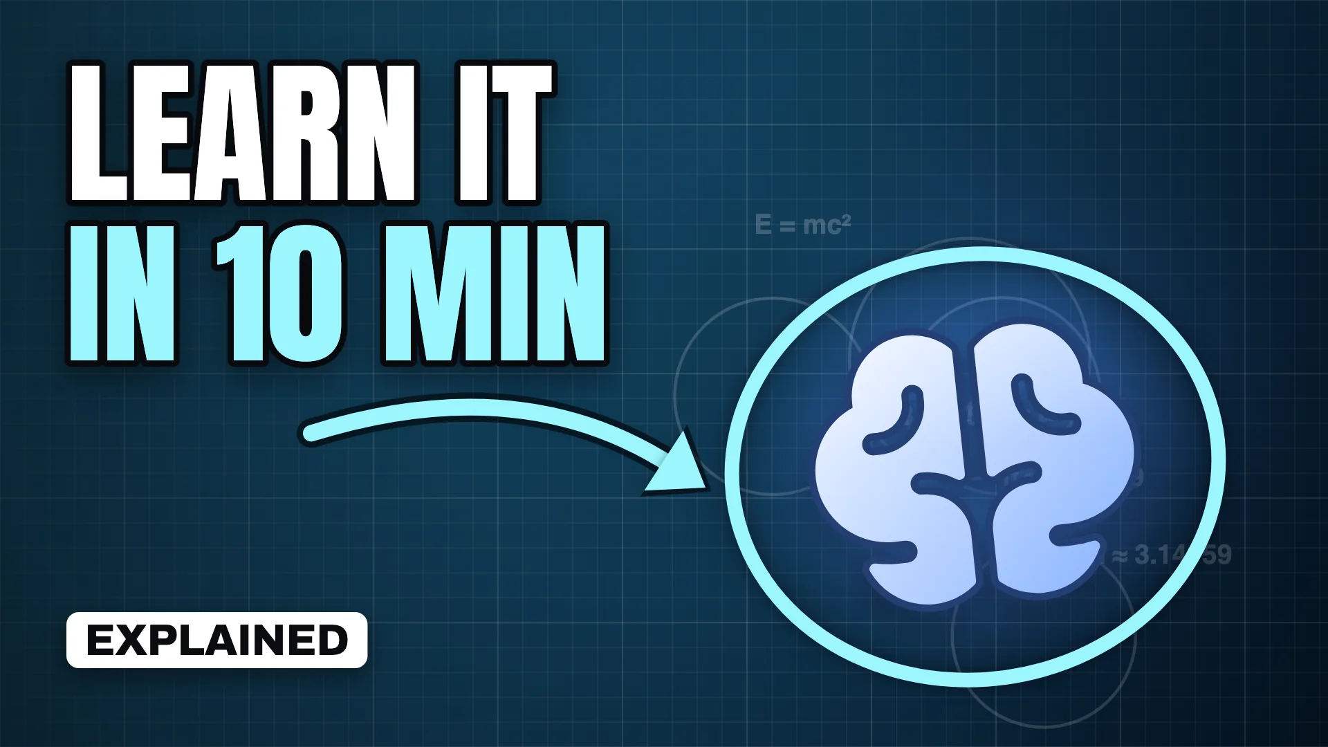
A time promise
"Learn it in 10 minutes" tells viewers the cost of watching up front.
The simple question
"Why is the sky blue?" works because everyone has wondered.
Myth vs fact
A split frame invites viewers to test what they believe.
One diagram
A blueprint background with a single highlighted shape signals a visual explanation.
Challenges thumbnail ideas
Challenge thumbnails need rules you can read in a second: who, how long and what is at stake.
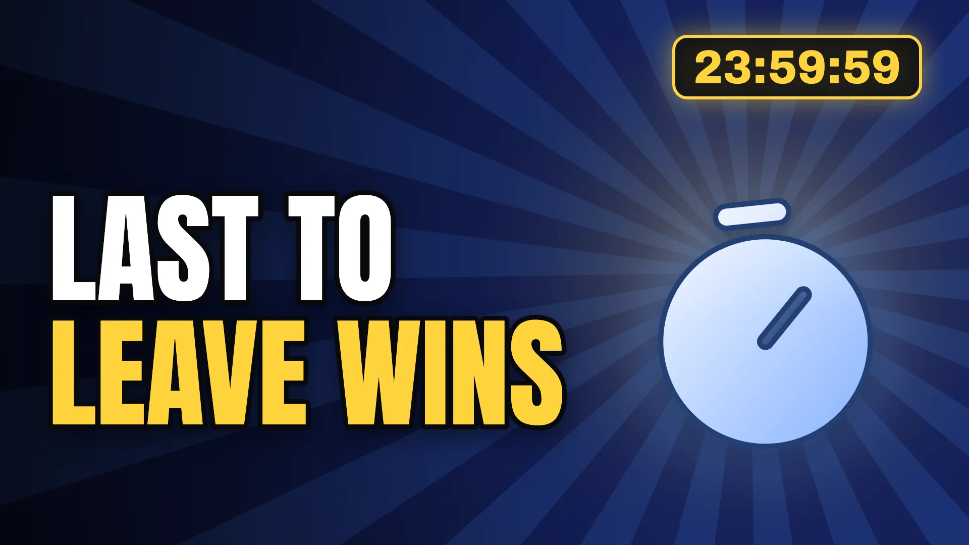
Last to leave wins
A timer badge plus four words explains the whole format.
The 30-day experiment
A big duration number promises a transformation.
$1 vs $1,000
A price versus layout makes the gap the story.
Survival
"Surviving 24 hours" with a harsh setting raises the stakes instantly.
Entertainment thumbnail ideas
Entertainment and commentary thumbnails promise insight. Tell viewers what they missed or what the ranking is.
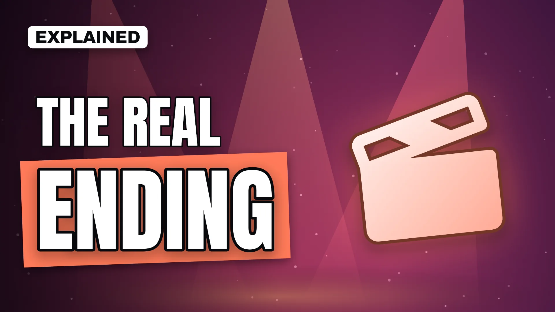
The real ending
"The real ending explained" implies most viewers missed something.
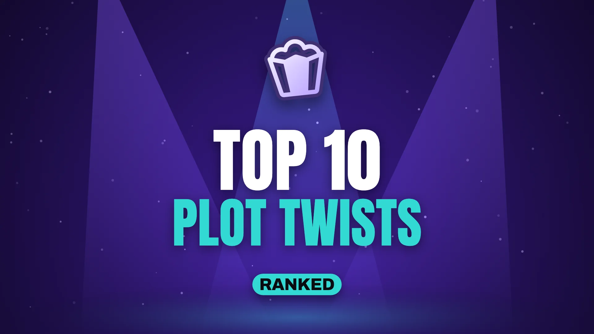
The ranked list
"Top 10 plot twists" sets clear expectations for list formats.
The missed theory
"The clue everyone missed" rewards fans who want to rewatch.
Behind the scenes
"How they filmed this" works with a single prop and a spotlight.
Thumbnail ideas FAQ
What makes a good YouTube thumbnail idea?
A good idea makes one promise visible in under a second: a result, a contrast, a question or a place. It matches what the video delivers and works without reading the title.
How many words should a thumbnail have?
Three to five words is a reliable range. The title does the explaining; the thumbnail only needs the hook.
Should every thumbnail include a face?
No. Faces help when the creator is the draw or emotion is the story. Objects, places and numbers work well for tutorials, reviews, travel and finance.
Should the thumbnail repeat the title?
Usually not. Repeating the title wastes space. Let the thumbnail add a second piece of information, such as the result, the stakes or the emotion.